


Colour speaks to us, and sometimes shouts. It can whisper danger, it can calm the nerves, it can suggest youth and zest, banality or exoticism, even eroticism, or it can suggest the height of elegance. Most of us love it, but would like to know more about how to use it well.
So what’s it all about? What’s an analogous colour scheme? Or a tetradic/double complementary? And what about the difference between a hue and a tint?
Zzzz…
The Colour Wheel
Let’s keep it simple. Let’s take the colour wheel, but with a pinch of salt. Let’s use it only when we need it, because it doesn’t tell us the full story, and because some designer will surely wave it about whenever we need to discuss interior design, so we need to know something about it. And because there is nothing sadder than a well-intentioned amateur whose brain has been scrambled by the colour wheel. Here it is:
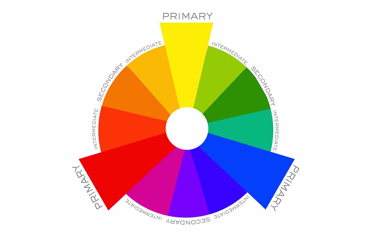
As you can see, the three physical primary colours are red, blue and yellow. They can be mixed to make any other colour. The colours beside each other are called analogous, but just think of them as colours that blend well together, and the colours opposite each other are complementary, but better think of them as colours that clash if not used carefully.
The other colours are more subtle combinations, and they have fancy names, but that’s about it. Basic theory is that you use a large amount of colours on one side of the colour wheel against a small amount of colours on the other. But it’s much easier to think of colours as being warm, cold or neutral, and not think of their names when using them.
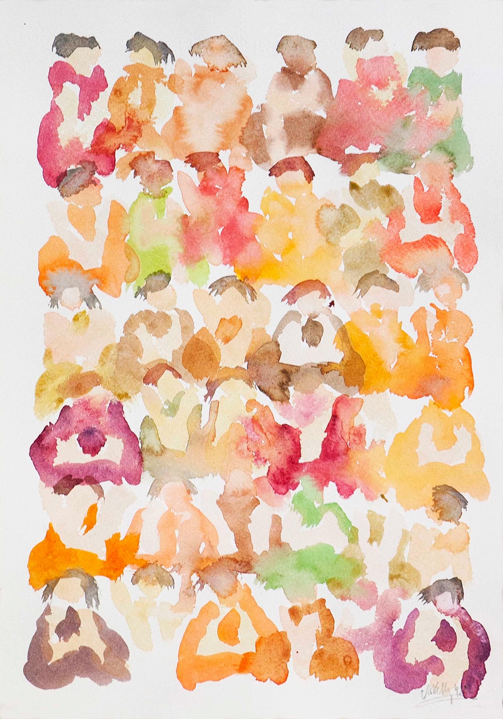
This painting (illustration above) shows us the dominant use of warm colours with a small amount of cold colours thrown in. The colours would work just as well together if warm and cold were reversed, using greens and blues as the dominant colours with some warm colours to spice things up.
You will notice here the absence of black and white. That’s because we usually think of black as a colour used only to darken other colours, creating shades, and white as a colour used to lighten other colours, creating tints. But we don’t really need to know that. Think of black and white as neutral colours which we can use on their own or together to tone down primary colours.
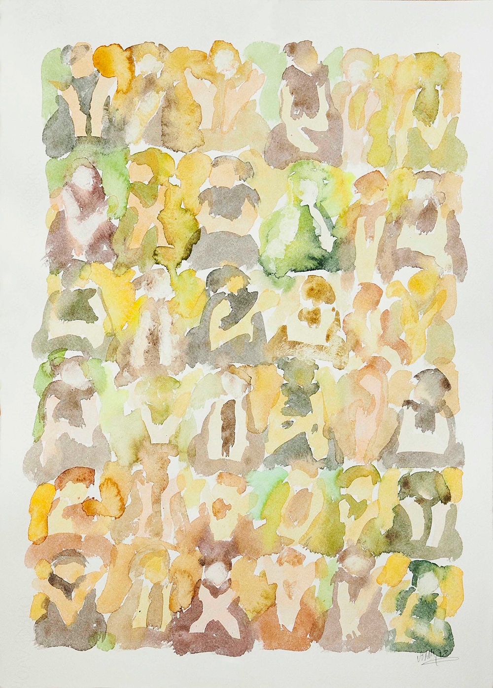
If we tone down our pure colours enough, mainly by the addition of white, we get pastel tones. The value of pastel tones in a painting, or in interior design, is that we can use all the colours willy-nilly, tossing them about without giving a thought to what blends or contrasts, because they all work together, given that none of them are pure saturated colours. To see how that works in practice, look at the painting below, done in pastel tones. (illustration below)
So where does that leave us? If still confused, think of a stew. The strongest flavoured foods are used sparingly, especially salt and pepper. And if you want to make the stew more interesting, add something that does not normally blend with the rest, like a piece of pineapple, maybe. But not too much.
Or think of a well-dressed man in a suit. The suit is the largest area and is normally not a saturated colour. The shirt may be coloured, but not too brightly, while the tie allows for a splash of pure colour without upsetting the overall scheme.
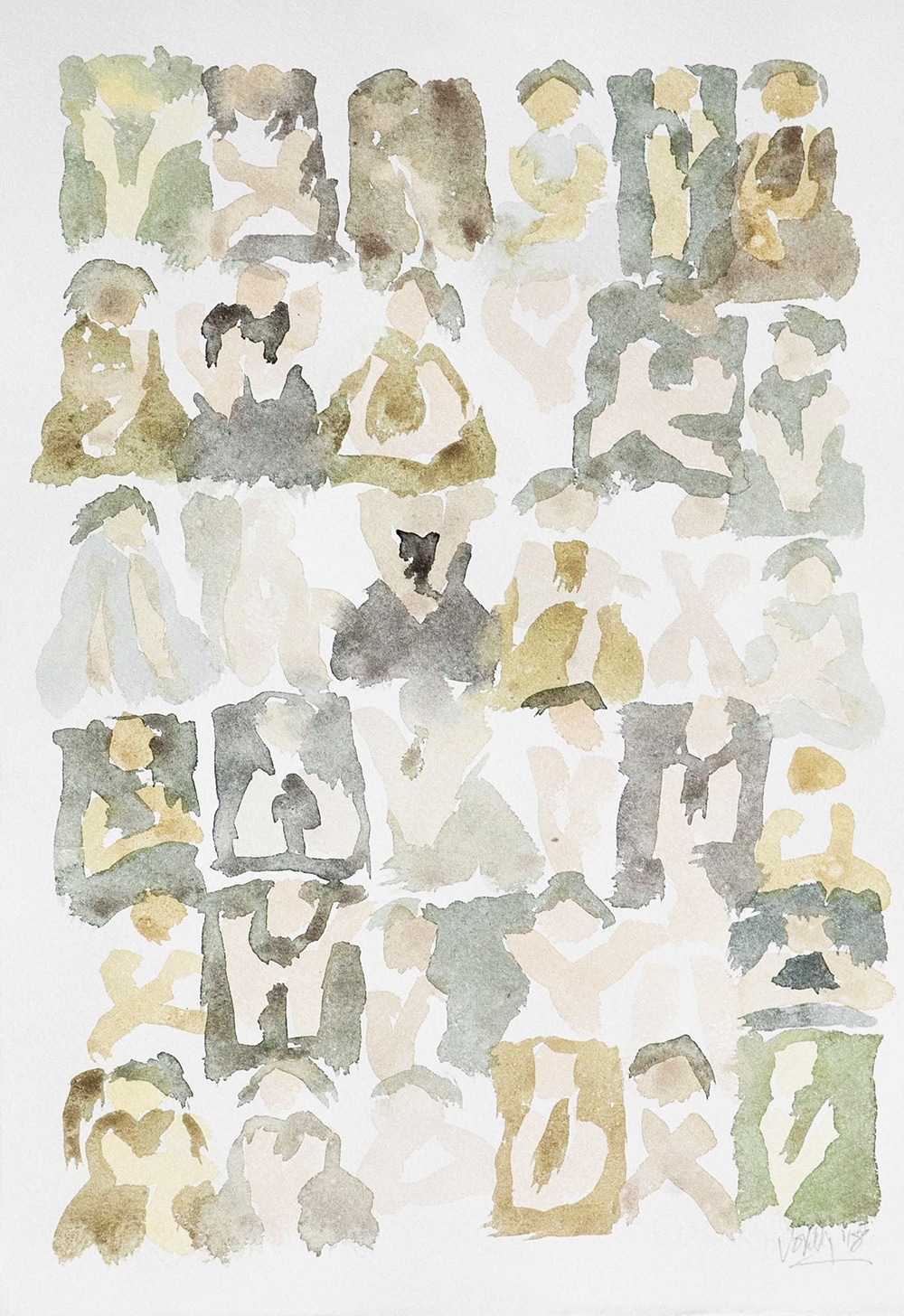
Of course, you could always forget about colour theory and stick to neutral tones, which are not on the colour wheel but are subtle combinations of different colours. Below we have a painting done in neutral tones, with the addition of very small amounts of greens and reds, and lots of background white showing through. (illustration bellow)
The more black and white used, the more neutral the result. Neutral tones always work well together, since there are no pure colours to clash, but it might be useful (or might not) to know a little about the psychology of colour to get them right.
Colour psychology tells us that warm colours are cosy and intimate, with the danger of becoming claustrophobic if over-used. Cold colours create more of an illusion of space and light, but again, subtlety is required. How long could you spend in a bright green room with a deep blue carpet without going crazy?
To say that specific colours have a specific effect on us could be a mistake. There is a very limited number of colours we can name, and those that have names can often mean different things to different people. While we can claim that certain basic colours seem to have the same effect on almost everybody, using the right colours depends on too many variables to stick rigidly to rules. These variables include lighting (both natural and artificial), texture and form. It’s not quite the same choosing a colour for a large plain sofa in a fairly empty room as for a dozen chairs around a table in a busily designed dining room, and a colour on a reflective surface can be very different from the same colour on a surface that absorbs light.
It helps if you can forget about names and think of colours as notes on a musical instrument. You don’t need to know what they are called to use them well. Just splash them about with half a mind on the colour wheel, or sprinkle them gently as if watering a delicate flower, without getting bogged down in colour theory. And remember the primary rule of all design: if it looks right, it is right.